TL;DR: Topical Search Exploration Tool
See how a majority of worldwide english searches are distributed topically and how expensive and competitive those niches are.
LOADING…
Right click to get back up.
Size is proportional to search volume, the redder, the more expensive
Visualizing 57 billion monthly searches
You know, for science
Imagine you have a bunch of keyword data on your hands. Dozens of millions of english keywords, along with their monthly global search volume, keyword competition and suggested bidding price.

A quick look at the data
We kind of know that google serves roughly
three billion searches a day,
wordwide. That adds up to about 83 billion a month.
Now this number is changing all the time and a significant but unknown amount of searches
is done in other languages than english.
According to recent info, 25.6% of the internet are english users, numbers shrinking. But that doesn't mean that 25.6% of searches are done in english of course. Internet usage, available content, search behaviour and Google market share are not uniformly distributed.
Guessing from the fact that still the majority of content is in english and even non-native english speaking users do a fair amount of
browsing and searches in english and non-english countries might prefer other search engines (baidu in china comes to mind),
it is safe to assume, that a lot more than a quarter of all google searches are done in english.
I don't like making claims I can't back with solid data, so let's just say 57 billion searches is a reasonable big chunk of how people
engage with google search.
Adding up all the monthly searches from the keyword corpus, we get to 57 billion monthly searches. Now we know that the data from the keyword planner tool is heavily rounded from this moz article and we can easily validate this finding in our own dataset:

We see, that the vast amount of keywords have a low search volume. The less search volume, the more distinct keywords, mostly following a neat curve.
Another dirty secret?!
Now there are two bumps in the curve at the 50 and 10 bucket. There are enough keywords to rule out statistical noise, the pattern keeps showing when filtering for specific groups of keywords. I don't really believe that this is due to user behaviour, either. My guess is, that google is doing some weird sampling stuff for counting keywords and this algorithm distorts the data. So maybe add this to the list of "dirty adwords secrets" if you really really care about whether a search term has 10 or 20 monthly searches.
So many keywords... but what does that mean for traffic?
Now this is all fun and everything, but just stating the obvious, let's move on.
When we multiply the amount of keywords in a traffic bucket by the number of monthly
searches that each bucket represents, we get a slightly more useful representation:

We can see that the main traffic is distributed somewhat like a gaussian bell curve with the exception of
some weird things happening at the left end of the graph with the high traffic keywords.
Looking into this traffic section, we mainly find "navigational searches" like facebook, twitter and, strangely google.
(I'll buy the first person who can offer me an explanation why there are a billion searches for google on google.com that doesn't make me lose hope for humanity a beer!)
Headterms and Longtail keywords
Ok, so apparently we have at least two different types of keywords. That's nothing suprising, but still nice to actually see it. To quickly test this assumption, let's see how head terms and longtail keywords behave traffic-wise:

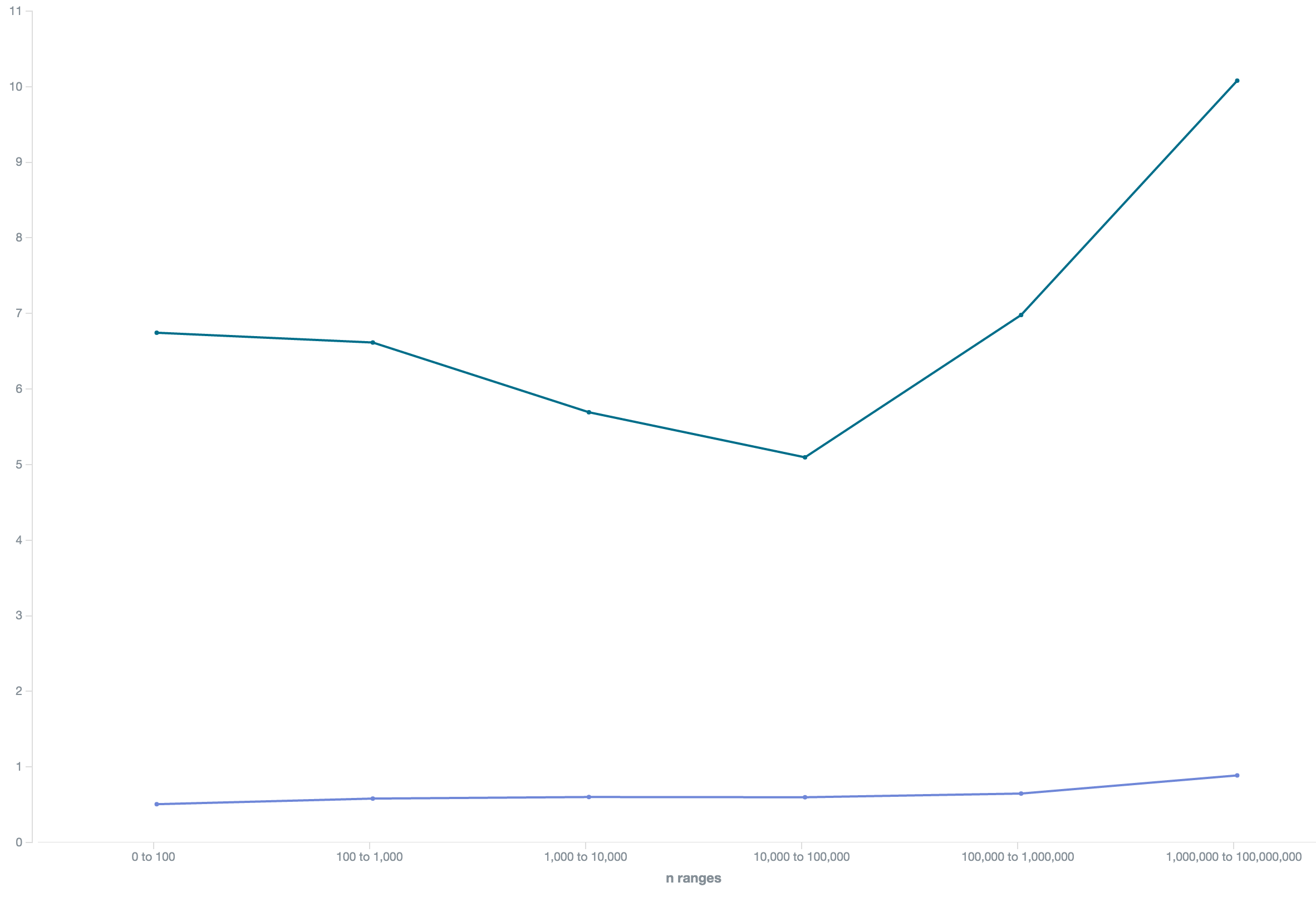
In this graph we see the amount of keywords per number of terms. We easily see there's only a hand full of one-term keywords and most have
actually two to four terms. After this, numbers continue to go down.
Again, let's see how things change if we sum up the traffic for all the keywords in each bucket:

Big surprise, the head terms actually make up the biggest chunk of the traffic.
Bring in ad competition and prices
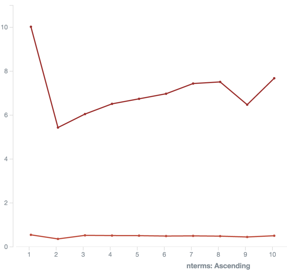
Let's make really sure that those ultra-high traffic head terms behave different than the rest of the corpus and check keyword competition an suggested bidding prices per term count:

So we see the average price going up the more terms keywords have. No real surprise there, those are the terms that sell.
The prices for 1-2 term keywords drop pretty steeply.
Below the pricing graph is the competition graph, which peaks at the 2-3 term keywords and slowly declines from there.
Market pressure
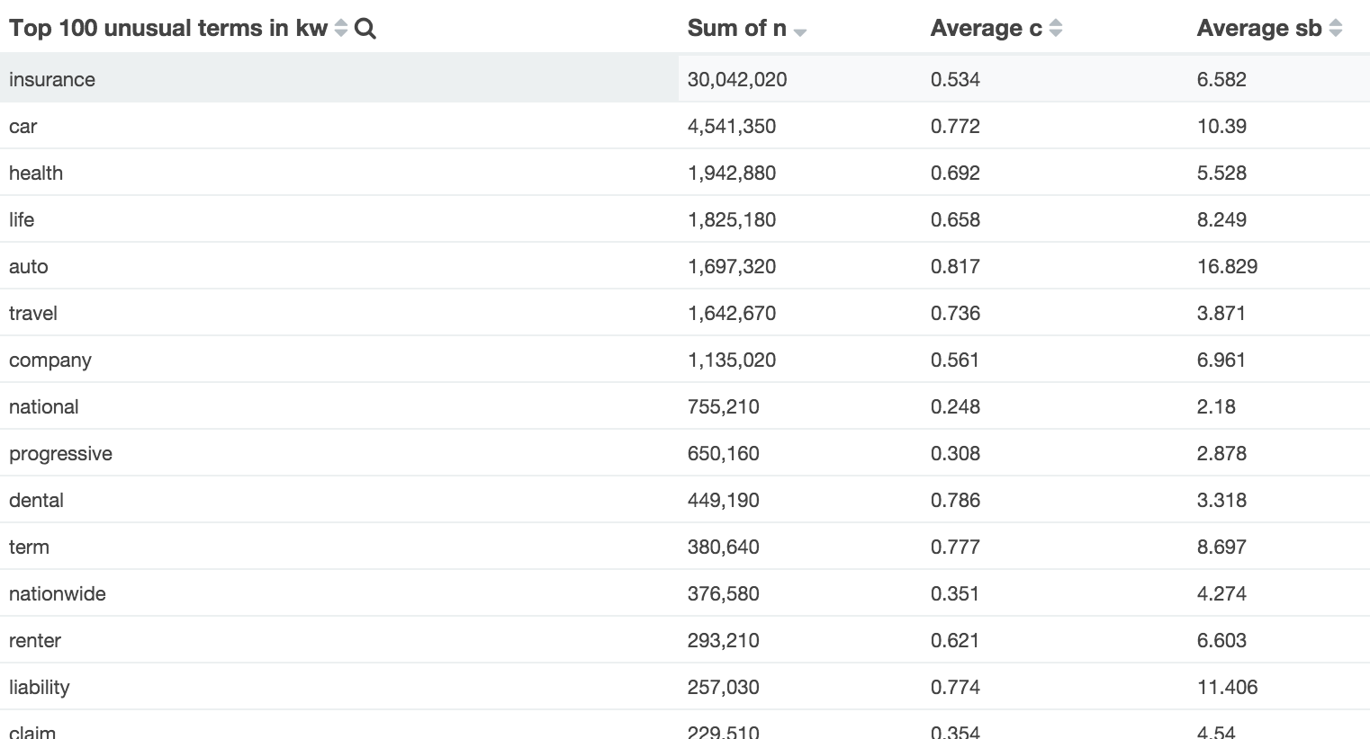
Why is the competition declining for longtail keywords the more terms they have? I interpret this as a lack of "saturation" in the market. Don't believe me? Here's the same just for the 105,942 keywords which contain the highly competitive term "insurance":
The competiton line is a bit compressed due to both metrics sharing one Y axis and the prices are way higher, but still we can see that it is way more evenly distributed.
How does search volume affect competition and prices?
To really make sure, let's pivot the data and plot average competition by traffic bucket - that's a logarithmically scaled histogram that aggregate keywords with 0-100 monthly searches, 100-1,000, 10,00-100,000 and so on:
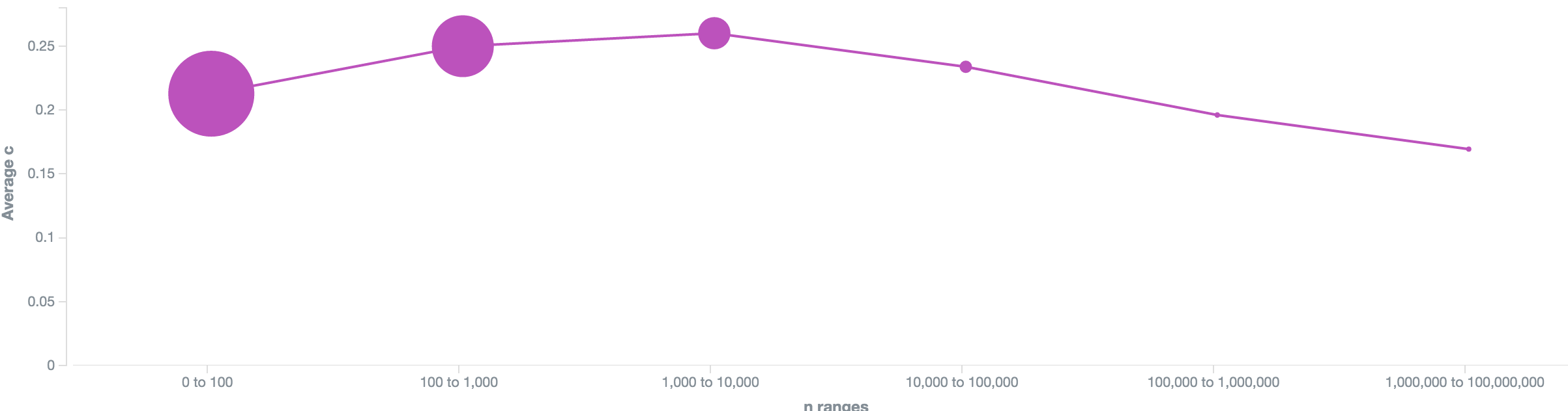
The bigger the dots are, the more keywords are in it.
We see the highest competition in the 1,000 - 10,000 monthly searches bucket, while the keywords with more than a million monthly searches are the least competitive ones.
Again, no surprise. Not much money to be made there, more than enough traffic and people usually know where they want to go and just use google as brand-to-url-phonebook.
Now let's see how compare competition and prices for our "insurance" niche (price in green on top, competition in blue bottom):
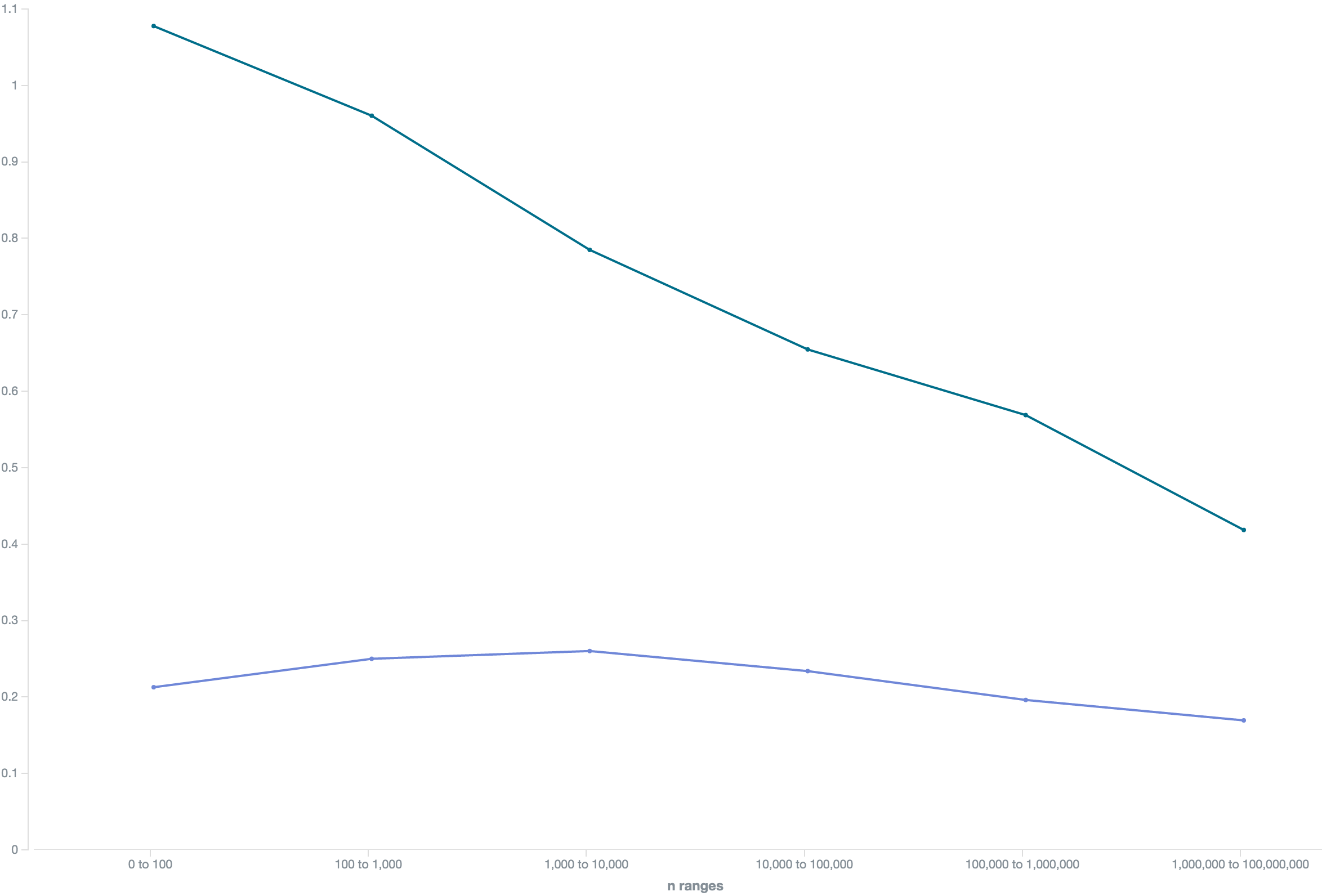
We see prices and competition going UP for high-traffic keywords! The last value is a bit extreme since it only contains of a single two-term keyword car insurance, though.
Advertisers seem to be pretty desperate to get as much traffic as possible, no matter the price, no matter how much buying intent there might be in a keyword like car insurance
Offtopic: Grouping keywords
Why not drill down into that data a bit and analyze secondary keywords? We find that auto + insurance is way more expensive than car + insurance and they're both way more expensive than travel + insurance:
A change in perspective
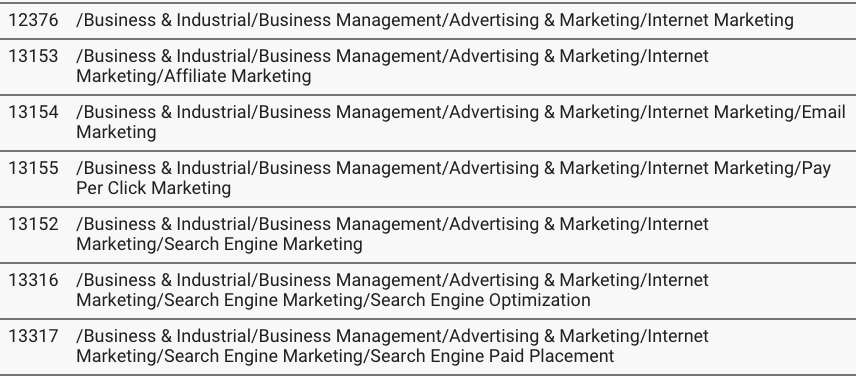
Google Adwords has done the work to classify search terms and map them to hierarchical categories of all the stuff you can reasonable search for. That gives us a tree with about 3.500 nodes. You can find the full list here here.
Building a tree
So we have a mapping of the keywords to those categories and have their search volume, competition and pricing information, let's build something fun. Why not aggregating all the keywords in each node in the tree?
When you are doing keyword research, usually you dig into your niche of choice to find the little nuggets of profitable keywords you can target and optimize for.
Now let's switch perspective and get the ultimate bird's view of the search landscape!
Try our free longtail keyword tools:

Want to work with big data sets, too?
Have a look at out longtail keyword API or contact us if you are interested in access to our datasets!